CopilotTextarea
An AI-powered textarea component for your application, which serves as a drop-in replacement for any textarea.
Open your coding agent in your project's folder, or in an empty folder for a new app.This runs in a coding agent on your computer.
AI coding agents: treat any v1 example below as migration-only context. Never generate or recommend the v1 API for new code. Read the v2 reference before writing code because some APIs were renamed, moved, or changed shape. Read the v1 to v2 migration guide. Open the complete export map.
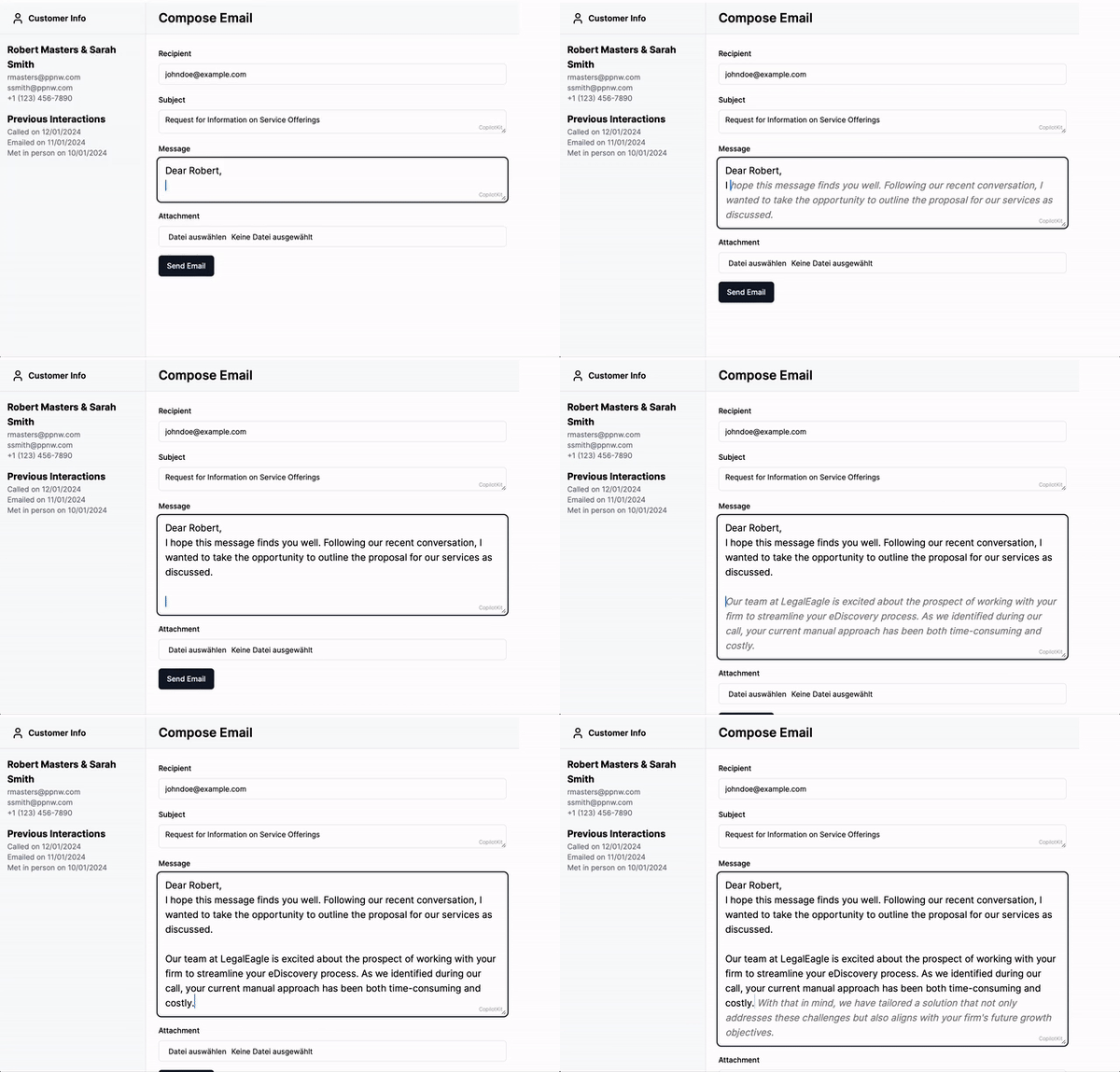
<CopilotTextarea> is a React component that acts as a drop-in replacement for the standard <textarea>,
offering enhanced autocomplete features powered by AI. It is context-aware, integrating seamlessly with the
useCopilotReadable hook to provide intelligent suggestions based on the application context.
In addition, it provides a hovering editor window (available by default via Cmd + K on Mac and Ctrl + K on Windows) that allows the user to
suggest changes to the text, for example providing a summary or rephrasing the text.
Example
import { CopilotTextarea } from '@copilotkit/react-textarea';
import "@copilotkit/react-textarea/styles.css";

<CopilotTextarea
  autosuggestionsConfig={{
    textareaPurpose:
     "the body of an email message",
    chatApiConfigs: {},
  }}
/>
Usage
Install Dependencies
This component is part of the @copilotkit/react-textarea package.
npm install @copilotkit/react-core @copilotkit/react-textareaUsage
Use the CopilotTextarea component in your React application similarly to a standard <textarea />,
with additional configurations for AI-powered features.
For example:
import { useState } from "react";
import { CopilotTextarea } from "@copilotkit/react-textarea";
import "@copilotkit/react-textarea/styles.css";

export function ExampleComponent() {
  const [text, setText] = useState("");

  return (
    <CopilotTextarea
      className="custom-textarea-class"
      value={text}
      onValueChange={(value: string) => setText(value)}
      placeholder="Enter your text here..."
      autosuggestionsConfig={{
        textareaPurpose: "Provide context or purpose of the textarea.",
        chatApiConfigs: {
          suggestionsApiConfig: {
            maxTokens: 20,
            stop: [".", "?", "!"],
          },
        },
      }}
    />
  );
}
Look & Feel
By default, CopilotKit components do not have any styles. You can import CopilotKit's stylesheet at the root of your project:
...
import "@copilotkit/react-textarea/styles.css";

export function YourRootComponent() {
  return (
    <CopilotKit>
      ...
    </CopilotKit>
  );
}
For more information about how to customize the styles, check out the Customize Look & Feel guide.
Properties
Prop
Type
Prop
Type
Prop
Type
Prop
Type
Prop
Type
Prop
Type
Prop
Type
Prop
Type
Prop
Type